


DNA+ Marketing Project
DNA+ is a precision genetics and wellness brand focused on making advanced
scientific insights easy to understand and apply in daily life. Powered by DNA
sequencing and epigenetic analysis, the brand combines science, personal health,
and modern lifestyle into one clear and accessible experience.
Our work for DNA+ included:
• Building a credible brand identity with a clear, approachable and modern presence
• Designing refined packaging for a professional and premium kit experience
• Developing e-commercial website with a user-friendly and intuitive structure
• Extending the brand across marketing touch-points with consistency and impact
This holistic approach helped position DNA+ as a trustworthy, modern, and science-driven wellness brand.
Client: DNA+
Brandfolks // 2025
Branding & Marketing
Designer: Koo Yu Ying
Art Director: Hwa Win See, Sin Kai Goh
Medical Advisor: Dr. James

Where Identity Meets Genetics
The visual identity of DNA+ was developed to express the brand's core values of clarity, precision, and scientific credibility. At the centre of the identity is a distinctive wordmark, where the "+" symbol is constructed from four DNA strands. This unique design element represents advanced genetics and multi-dimensional insights, while reinforcing the brand's strong foundation in biotechnology.
To support the brand's positioning as both professional and approachable, Plus Jakarta Sans was selected as the primary typeface. Its clean geometry and contemporary character create a balance between scientific authority and accessibility. The use of a light blue and white colour palette further strengthens this positioning by conveying trust, clinical precision, and calm assurance.
Supporting DNA brand graphics were also introduced to build a cohesive visual system, allowing the brand to maintain consistency across packaging, digital platforms, and marketing materials.

Designed for Clarity,
Built for Trust
The DNA+ test kit packaging transforms a complex scientific process into a clear and reassuring experience. A clean white exterior paired with soft blue gradients creates an immediate sense of professionalism and trust, while the minimal layout ensures the product feels premium without overwhelming the user.
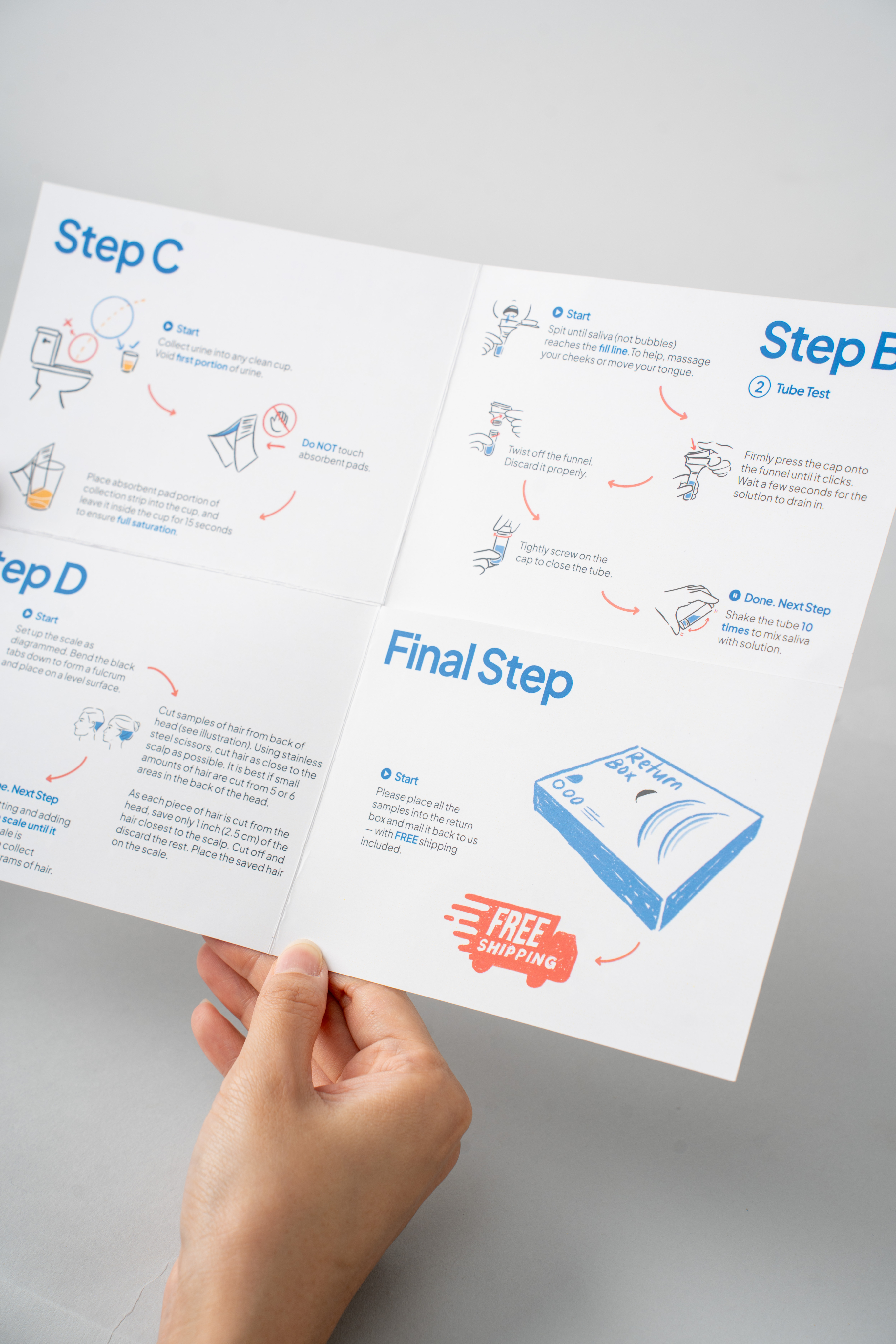

Beyond aesthetics, the packaging was designed to guide users through each step with clarity and ease.
Its organised compartments, instructions, and components create a logical flow that improves usability and reduces confusion.
Supported by subtle graphic elements and consistent visual cues, the overall experience feels approachable, structured, and true to the precision of the DNA+ brand.

Explore how epigenetics
influences gene expression,
connecting your
DNA
with lifestyle choices to shape your
future health and potential.


Building a Consistent
Brand Presence
The marketing approach for DNA+ was designed to ensure clarity and consistency across both offline and digital touchpoints. For offline materials, we developed clear and informative brochures and flyers that communicate complex genetic concepts in a simple, structured manner, reinforcing credibility while making the brand more approachable to a wider audience.
On the digital front, we focused heavily on social media as a primary channel for engagement and education. Through ongoing content management, we designed a series of static visuals and video content that translate scientific information into digestible, visually compelling formats.


Our work with DNA+ showcases a fully integrated brand experience, from identity development to packaging, digital platforms, and marketing communications. Each touchpoint was designed to simplify complex science, build trust, and create a clear, consistent journey for modern health-conscious consumers.
To learn more about how DNA+ supports better health decisions through genetic insights, explore their social media channels and see how science can fit into everyday life.
Official Website: dnaplus.asia
Facebook: DNA PLUS
Instagram: dnaplus.asia
